6.30.2010

Legitimate progress

I've actually been learning something. I've been studying light sources and color theory. Both are very simple concepts, but it really takes practice to master. Once you do, you can really do some amazing things. I haven't mastered either but I'm working on it.

I've also been taking time to learn at least one new technique in Photoshop per week. After having been away from my work computer for so long, I saw that at some point I'd stopped getting any better. I guess I just settled into a routine. I have to force myself to break the bad routines.

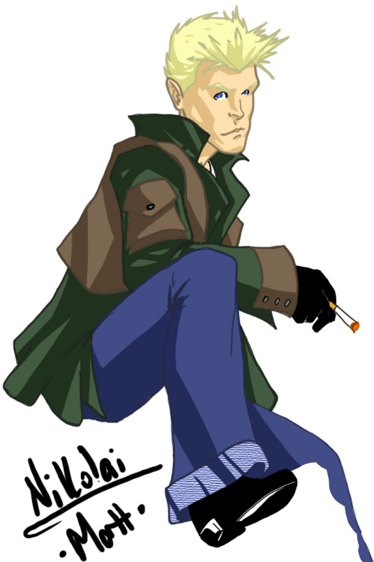
So yeah, here's a side by side of the same image. I feel they look worlds different and hopefully it's translated into something that everyone can see. Enjoy.


                                                   Older version                                                   New version

I think the biggest difference is the line work. I found a means of inking that really tightens up my line work. I was free handing before, which a lot of people do, but I've never been one to use a heavy line weight when I pencilled. My lines would get thicker as I inked in photoshop because it was the only way I could really smooth them out. Now the lines are very close to what's on the paper.

I've also started to add a little (very little) depth to my colors. I've always cell shaded, which I still do, but I've started adding a heavy shade of the existing color as well. Once I've mastered this, I'll start adding hi-lights. If you look at my earliest photoshop stuff, you'll see I tried to do that early on, but I could rarely get that to work. I've found a lot of good resources deviantArt.com. 

So yeah, baby steps... but I'm loving the walk.

6.22.2010

"What? Is there blubber?"

Another speed exercise. I messed up really bad about 2/3's of the way through this piece and couldn't actually finish it. Since I was trying to get through it as fast as I could, I never stopped to save my progress... so yeah, double Matt fail.

6.21.2010

"Faster! Faster would be better!"

I threw some colors on a sketch as a speed exercise. My process has changed somewhat, since the last time I was putting art on the web. It's about 50/50 between traditional and digital. I do layouts on paper, detail in pencil  then I decide if I'll ink with, well ink, or do the ink lines in photoshop. That choice is determined by how much rendering I did in the pencil phase. After the inks, I do all the coloring in photoshop. That will change shortly since I actually have full sets of high quality markers, colored pencils and paints. But yeah, I'm so out of practice in PS that I've been doing some speed exercises. Here's one crappy piece.

6.19.2010

Future Tense

First digital work in a while. My computer can barely handle the stress of a pen tablet and photoshop, but it worked. Just took about 4 times as long as normal. This was a warm-up/practice.

6.17.2010

Sketches and WiP's

So the pencil sketches will be used as WiP's to show my process from sketch to complete color. Dark Pheonix and Storm were a couple of the 10 minute exercises I've been doing to stay loose. 


7.12.2009

Seas Apart


I'm doing this character pics and as I dig up all these old players and friends I'm thrust back to the time that I knew them. I've found myself listening to the entire Prince catalogue these last few days because he was big and we were all big fans of his music at the time. Anyway, the air in my head is thick with nostalgia and I don't expect that to change until I'm finished with these pics.

This is Taylor. Player character. Taylor and Deathadder (previous pic) were married irl. My lady and I spent a lot of time with them in 89-90. Miss you all.

7.11.2009

Anniversary images


So, I don't think I mentioned here that July is the 20th Anniversary of the Four Horsemen RPG. We started playing in July of 89 when I came back to NY from New Mexico. I'm doing up a bunch of commemorative art and other little doodads for viewing. This is the character of one of the earliest players of the game.


PS7/ Intuos 4

7.08.2009

Break on Through


I had a lot of really good conversations and got some good news these last few days and it seems to have helped me break out of my slump. It's nothing fancy but I like it more than any of the other crap I've put out in the last 10 days.

PS7/Intuos 4

7.04.2009

Slowly but surely...


Ok, I've had a terrible creators block for the last week. It's been pretty bad since I finished the commission work for Priest's EPIC Adventures. I keep trying to crank stuff out and work through the block but no real success until this one. It's really not that good, but it's something and at the very least a first step to breaking through.

6.26.2009

Shadowing


First character I ever made in an RPG. Rock Star/Hero. Telepath/Telekinetic/Empath. One cool mofo.

10 minute negative space painting in PS7.

Cover final- PEA


***EDIT*** There were flaws in the color from resizing, I'm guessing. Here's the corrected.


There's a fellow named Pete Hernandez who's an amazing illustrator. He's been doing some artwork for the same RPG that I have and, in a nutshell, he's been blowing my work out of the water. This prompted me to elevate my game a bit and really push myself to learn Photoshop 7. He's still worlds better than me, I have no illusions about that, but I felt that I owed it to Will (the game creator) to give it everything since I had the cover. So here it is, the cover redone. I'm happy with it, considering where my skill level is and the short amount of time it took me to get here.

Thanks Will for the opportunity and thank you Pete for all the help you gave me with PS and silently pushing me.

Futuramicus


I was going for a retro look, but since I didn't reference anything, it doesn't quite look retro. I like it and will use it still. I need to learn more color theory...

6.25.2009

Hollywood Vampire...


Without giving too much away, this pic is part of something larger so the gradient background is only for display by itself.

6.24.2009

Incredible


Holy crap. This is kinda scary. I settle on the technique and everything from beginning to end seems so much easier now. This only took me 2 hours and 45 minutes to do.

All digital. Photoshop 7.

Evolution


WooHoo! I think I've finally gotten a handle on how I'm going to color, as illustrated above. It's a combination of a lot of different styles (as I'm sure a lot of indy artists are Dr. Frankensteins when it comes to this) and I think it best suits my style of line work. Hope you like =)

6.22.2009

Finding my North


So, as I learn more about my trade and it's tools, I get anxious to test things out. So the stuff I've been putting up is mainly without too much thought behind the composition...

I had a lot of fun with this piece and, with the exception of the minor hi-lights at the very end, it all came out the way I thought it would. Very cool.

6.21.2009

WageSlave


WageSlave concept for Priest's Epic Adventures. I've refined my line work and shadows a lot. Simplified the shadows while going deeper in the line work. I think that's working out well for me. I've started to try and learn effects and shapes now. Nothing fancy yet, but my grasp of photoshop is improving daily and I think I'll have some really good stuff soon.

6.19.2009

Relief?


This one came out a lot better. Cell shading felt good but the hi-lights are still tough. Also, I focused a little more on the line work, something I've gotten away from since I got the tablet.

6.18.2009

Love, Hate, Love...


I fucking hate this picture. I figured it would get better as I go but the further along I went, the worse it got. There are so many different shading techniques and I'm having a lot of difficulty figuring out which technique is best for which lighting. I probably should have gone with simple soft cell shading for this, but I thought I'd flex my muscles... muscles I don't have apparently.

Anyway, the fire technique is nice. Something I picked up in a tutorial. A little more practice and that will look sick.

6.14.2009

More re-color


Again with the re-coloring... This one, I may like the original colors better than the new one... dunno though...

Freshen Up...


I've been studying a lot of video and reading some articles on coloring. Mostly good stuff, but a lot of these guys talk like you already know your way around photoshop... that parts a little annoying...


Anyway, I picked up some new techniques and wanted to give them a whirl. Re-did the colors for Victoria Scarlet. I've reposted the original along with the new version for comparison. I like the new one... I like the old one too though... a little help here... =)


6.13.2009

Grrrrr....


Trying to employ some techniques that I've seen on YouTube... doesn't quite work the same. Gotta figure out the problem...

6.10.2009

fun fun fun


I'm getting comfortable with this digital thing, so I'm starting to add a little movement. This was fun!

6.09.2009

See it through...


This pic did not feel like it was coming together at all. I'm trying to get into the habit of finishing everything, though. So I toughed it out and in all honesty, it's not as bad as I thought it would be. Actually, I kinda like it. I've watched a WHOLE LOT of digital painting videos, taking small parts of many artist techniques to suit my personal style. I feel I'm making progress, but I'm still a ways off from having the really fine finish you see in so much digital work these days... 

... just gotta keep on, keepin' on...