12.29.2010

Gemini Blue


So, it doesn't end with the art for me. I'm writing this web strip as well. I find that it's true when they say there are no original stories. One of the best ways to add depth and interest is by creating great character dynamics in the storytelling. Now, I don't know if what I've created is considered great, but I'm trying. The Gemini Sisters in this Four Horsemen story will have a dynamic that I've never worked with before and that has me excited, which is why it may seem like I've given them a little extra attention... because I have. Hope you like.

Matt

11.08.2010

And the winner is...

The HULK!!! Yep, by far the most requested character for commissions that I've received. I have an admission to make. I love drawing the Hulk too! Truth be told, I was never one for drawing characters that were properties of others. Really, I just spent a lot of time working on my own stuff. Now that I've been doing all this work for other people, I gotta admit that I do enjoy it.

Motoko Kasunagi

Ghost in the Shell. I was thinking of a good friend of mine when I did this. He told me once that he was a big fan. I loved the first movie. Couldn't really follow the show because of time constraints. I never understood though, why they had to put Motoko in the skimpiest clothing. Well, I finally figured it out... BECAUSE IT'S COOL AS SHIT TO DRAW!

Hey Tim, I'll do a proper piece and mail it to you =)

11.05.2010

Sketch Dump

Over on deviantArt, a lot of artists composite their better sketches into a single page to display. I always loved sketches and rough work because it's most reflective of the creative process, but also, there seems to be so much more energy in sketches than in fully realized images sometimes. I find the whole thing very inspirational. So here's my attempt at one of these sketch dumps.

One thing I did realize in this sketch dump is that a reduction in the size of the art from the original is really a good thing. In this digital age, where so many people are creating art from scratch on their computers, a lot of times the final art isn't reduced in size. The images in the sketch dump look so tight and so much better than the originals, I think I need to keep that in mind in all of my work. Work big, display reduced.

10$ Commission Samples

I've been doing a lot of commissions lately, varying from $10 sketches all the way up to $100 full color compositions. Here's some samples of the $10 dollar sketches.


9.26.2010

"Sure as my pretty floral bonnet, I will shoot you dead."

This actually started as a Tia study (the only female), but I liked the flow of it so well, it became a character mosh. I ended up liking the composition so much that I immediately thought it could be something for Priest's Story written by my good friend William Corpening since they were in fact, characters from that story. Will saw it and his first thought was, "That should be the cover"... So, it's the cover.

9.21.2010

OA pencil samples

Concept images and panel samples from a couple of the Four Horsemen projects I'm working on.


8.13.2010

"I was aiming for his head..."

Work on the banner continues. Here's the Sidewinder part. There's tons more going on the banner. Even though I've shown 5 or 6 pieces of it, there will still be plenty to reveal. Hope you like the pieces though.

8.11.2010

"I just like to leave my options open, is all."

I'm working on this grand and somewhat elaborate (for me) new banner for this site. It's taking a little longer than I like because I'm being a little more critical of my work for this piece. Anyway, here are some more pieces of that banner to-be.

7.31.2010

Banner Teaser

So I'm working on a new banner for this blog. Here's a small sample of the banner.

7.21.2010

"I aim to misbehave..."

It's been so long since I've drawn the hero of my little world. I present, Robert Mason of the Four Horsemen.

"... and Lord I never drew first but I drew first blood..."

7.17.2010

"You're like an untrained ape!"

This is the kind of image I have trouble posting. There are a few other images on this blog where I felt the same way. I started this image with the intention of practicing focus, light and movement. I think I hit the focus part well, the light part OK but the movement part I missed. I feel like missing one part ruins the whole thing. Still, I post this stuff so I can mark what I've been working on, but also to put it out there to be judged. I know that judgement is quite harsh sometimes, but I also know the next attempt will be better and having the two documented for me and others to see helps me grow somehow. So enjoy it if you can and if you can't then remember this image in the future so we can see how far I've come.

7.14.2010

More practice


The pencils for this were a few years old. I just wanted to practice the inks and colors. Shadows are my enemy.

7.11.2010

"We named the dog Indiana."

Almost forgot to post this one. 90 minute sketch I did at a friends request. Lots of fun, though I did use reference since I'm not usually tapped for likenesses... which by the way, I'm no good at. I chose a profile because it's a little easier for me to draw and I think I can capture someone's likeness a little better.

"Well, my days of not taking you serious are certainly coming to a middle..."

So this image was loaded with all sorts of little tricks and stuffs I've been learning about. Problem is that it didn't need 90% of those little doodads. I could have take a bit more out (especially the blurs) but overall I'm happy. I know, I know... I need to work on what space and planets look like. Still, this was fun.

EDIT*** I uploaded a newer version without a lot of the effects. Much easier on the eyes.

7.09.2010

"... and if wishes were horses, we'd all be eatin' steak."


Work in progress using my current inking and coloring techniques. So far, the feedback is good. I think I still need to tighten up shadow and light in my colors, but still, this is a lot better than what I was doing a few weeks ago. Oh, and faster too, now that I've gotten used to it.

7.01.2010

"... 10% of nuthin' is, well lessee... nuthin'!"


Just fumbling around with some characters for the forthcoming 4 Horsemen web strip.

" ... and hijinks ensued."


This was a 90 minute sketch I did at a friends request. Lots of fun, to say the least.

6.30.2010

Legitimate progress

I've actually been learning something. I've been studying light sources and color theory. Both are very simple concepts, but it really takes practice to master. Once you do, you can really do some amazing things. I haven't mastered either but I'm working on it.

I've also been taking time to learn at least one new technique in Photoshop per week. After having been away from my work computer for so long, I saw that at some point I'd stopped getting any better. I guess I just settled into a routine. I have to force myself to break the bad routines.

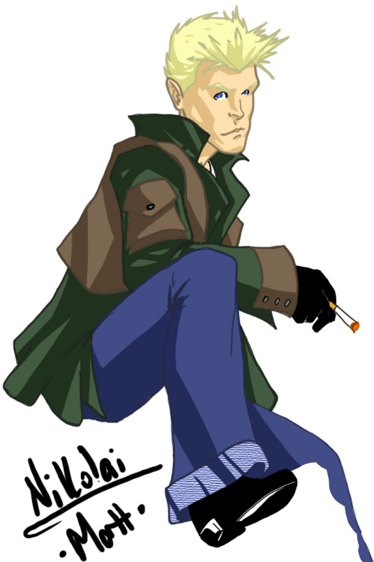
So yeah, here's a side by side of the same image. I feel they look worlds different and hopefully it's translated into something that everyone can see. Enjoy.


                                                   Older version                                                   New version

I think the biggest difference is the line work. I found a means of inking that really tightens up my line work. I was free handing before, which a lot of people do, but I've never been one to use a heavy line weight when I pencilled. My lines would get thicker as I inked in photoshop because it was the only way I could really smooth them out. Now the lines are very close to what's on the paper.

I've also started to add a little (very little) depth to my colors. I've always cell shaded, which I still do, but I've started adding a heavy shade of the existing color as well. Once I've mastered this, I'll start adding hi-lights. If you look at my earliest photoshop stuff, you'll see I tried to do that early on, but I could rarely get that to work. I've found a lot of good resources deviantArt.com. 

So yeah, baby steps... but I'm loving the walk.

6.22.2010

"What? Is there blubber?"

Another speed exercise. I messed up really bad about 2/3's of the way through this piece and couldn't actually finish it. Since I was trying to get through it as fast as I could, I never stopped to save my progress... so yeah, double Matt fail.

6.21.2010

"Faster! Faster would be better!"

I threw some colors on a sketch as a speed exercise. My process has changed somewhat, since the last time I was putting art on the web. It's about 50/50 between traditional and digital. I do layouts on paper, detail in pencil  then I decide if I'll ink with, well ink, or do the ink lines in photoshop. That choice is determined by how much rendering I did in the pencil phase. After the inks, I do all the coloring in photoshop. That will change shortly since I actually have full sets of high quality markers, colored pencils and paints. But yeah, I'm so out of practice in PS that I've been doing some speed exercises. Here's one crappy piece.

6.19.2010

Future Tense

First digital work in a while. My computer can barely handle the stress of a pen tablet and photoshop, but it worked. Just took about 4 times as long as normal. This was a warm-up/practice.

6.17.2010

Sketches and WiP's

So the pencil sketches will be used as WiP's to show my process from sketch to complete color. Dark Pheonix and Storm were a couple of the 10 minute exercises I've been doing to stay loose.